Overview
As you may know, I have been on a quest to learn vibe coding with AI over the past month or so. The product I built was Rishabh's Market Dashboard, a real-time market data visualization platform. I wanted to build an online dashboard that acts like a "health monitor" for the economy and stock market.
Link: 🔗 Rishabh's Market Dashboard 🔗
I personally use these indicators to drive my trading decisions, but I was gathering the data manually in excel sheets every month and analyzing them. I wanted to automate the process, apply statistical modeling to the data, and derive insights with visual dashboards to make it accessible for everyone to use.
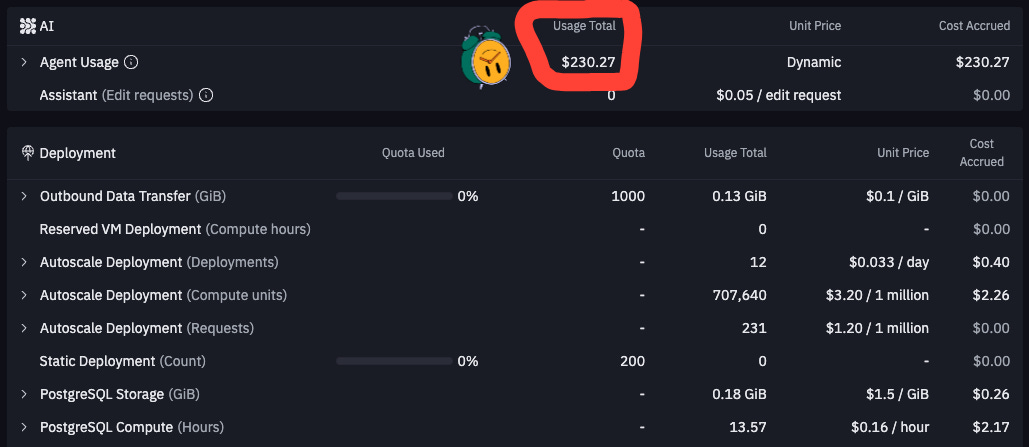
The Cost [$230.27 in credits + $50/month for APIs]
Total Cost: $230.27 (Replit development costs) + $50/mo. (Data Feed APIs) + many late nights learning coding and making (many) mistakes.
Outcome: 🔗 Rishabh's Market Dashboard 🔗 (totally worth it!)
This post outlines the following:
(1) What I learned about coding and building products (with zero prior experience)
(2) The functionality of the dashboard
🛠️ Coding Challenges
I started my coding journey with zero coding experience. I went through multiple prototypes spent over $200 in AI credits to learn some lessons the hard way (by doing). The most important thing I learned was that architecture and product thinking are the foundation for everything. Bad architecture leads to bad data structures, API issues, and unnecessary features that don't add value to the end user.
I share the “lessons” I learned (with my mistakes in great detail) below!
1. Your Blueprint Matters
Initially, I saw all my problems (stale data, API failures, slow load times) as separate issues. They weren't. They were all symptoms of one root cause: I didn't have a solid systems architecture. I started with building features instead of planning first.
Mistakes I Made
Stale Data Problem: My dashboard showed old stock prices because I didn't plan how data flowed from APIs to cache to display
API Failures: I hit the API rate limits quickly because I made repeated, sequential API calls instead of batching them over time.
102+ Second Load Times: My momentum analysis took forever because I was fetching RSI data for 12 ETFs sequentially instead of in parallel batches
I realized all these were symptoms of not having a data flow blueprint. I should have first mapped out: "API → Cache → Database → Frontend" with proper rate limiting and batch processing from day one.
Solution: Architect Before You Implement
Before writing any feature code, I needed to whiteboard my entire data structure. How does a stock price get from the Twelve Data API (with rate limits) into my database, then displayed with proper caching? I learned to always start with the "what and where" of data first.
Model Your Data First: Before anything else, define the following
Schema: What specific tables, columns, and data types do you need?
Data Flow: Whiteboard it! Trace the entire journey of a piece of data: from the external API to your database, how it's retrieved for calculations, where the result is stored, and how it's finally served to the user.
Relationships: How do different data stores relate? How will you perform a calculation that requires data from two different tables or APIs? How will you handle formatting differences?
Plan for Constraints: Don't wait to discover that your API has a rate limit. Design your data retrieval and caching strategy around these constraints from day one. This planning makes your system inherently more efficient and resilient.
2. Fight Feature Bloat & Clean Up Your Mess
In the excitement of building, it’s easy to get carried away adding features or leaving old experiments lying around. This creates a bloated, confusing codebase that's hard to maintain and update.
Mistakes I Made
I spent weeks integrating an AI-powered summary feature. The results were inconsistent and it dramatically slowed down page load times. The feature added 30+ second delays to page loads and triggered expensive API calls which were burning through my credits. I had to cut it.
I built out an entire email notification service. This email service included a SendGrid integration, database tables, and cron jobs. I ultimately deleted it, but I forgot to clean up the technical debt—useless code that complicates the system and invites future bugs. This resulted in unnecessary latency issues and a web of code dependencies that no longer served a purpose.
The Solution: Be Disciplined - Cut Losses (and Tech Debt) Early
Validate Features with a Proof of Concept (PoC): Before fully integrating a complex feature, build the simplest possible version to answer key questions. Is it reliable? Is it performant? Most importantly, does it actually help the user? Be ruthless about killing ideas that don't pass the test.
Practice "Code Hygiene": When you cut a feature, remove the code, the dependencies from your code, the environment variables, and the database tables. Every piece of abandoned code is a potential liability (and has a real cost).
3. Deliver User Value, Not Just Data
For a long time, I was focused on technical execution. My breakthrough came when I stopped asking "What can I build?" and started asking "What does my user need to achieve?" This shift in perspective is important.
Mistakes I Made
I had built a dashboard that was "data-rich but information-poor." But by just dumping numbers on the screen, I wasn't helping the user. The app was data-rich but information-poor. For example, I couldn’t answer questions like: Which sectors were actually worth watching? Is the economy overheating?
The Solution: Put the User First
Your Ultimate Goal is to Deliver Insight. Users don't want raw data; they want answers, clarity, and the ability to make better decisions. Your job is to bridge that gap.
I stopped asking "What data can I show?" and started asking "What decision does my user need to make?" This meant rethinking my entire service architecture. I built statistical analysis services 🧮 that calculated variances, percentiles, and z-scores.
Z-scores to show which economic numbers were statistically unusual
RSI color coding (red >70 overbought, green <30 oversold) to guide trading decisions
Momentum classifications showing 8 bullish vs 2 bearish sectors instead of just raw prices
Risk-Return charts that visualized relationships instead of dumping tables
How to Put the User First:
Prioritize Ruthlessly: What is the most critical information the user needs? For my financial dashboard, it was a few key metrics and clear trend visualizations. I focused on making those 100% accurate and lightning-fast.
Make Conscious Trade-offs: Does the user really need real-time data that costs a fortune in API calls and risks instability? Or is a 5-minute cache during market hours perfectly acceptable if it guarantees a sub-second load time? A product mindset helps you make these compromises intelligently.
Guide the User to Insight: This is where the real value is created. Instead of just showing a stock's price, show it on a chart with its moving average. Instead of just listing economic numbers, use z-scores to show which numbers are statistically unusual. As you can see from my dashboard, visualizations and statistical context turn a simple data dump into a powerful analytical tool.
By thinking like a product manager, you ensure that your well-architected, resilient, and performant system is also something people will actually want to use.
🎛️ Dashboard Features
Why did I build this dashboard?
To Solve Information Overload: This dashboard consolidates the most critical indicators into a single, organized view, saving the user from having to gather and analyze this information manually.
To Provide Instant Context and Normalize Data: The core feature of this dashboard is the Z-Score, which measures how many standard deviations a current data point is from its 12-month average. This is crucial because it allows the user to compare otherwise unrelated metrics on an apples-to-apples basis (statistical significance). It also elevates the most significant economic surprises and technical readings to the front and organizes them for users to analyze.
To Enable Rapid Decision-Making: The visual design (clear categories, color-coding for positive/negative scores) is built for speed. You can take a glance in seconds get a strong sense of whether the economy is running hot 🔥 or cold ☃️.
Feature 1: Sector and Momentum Analysis
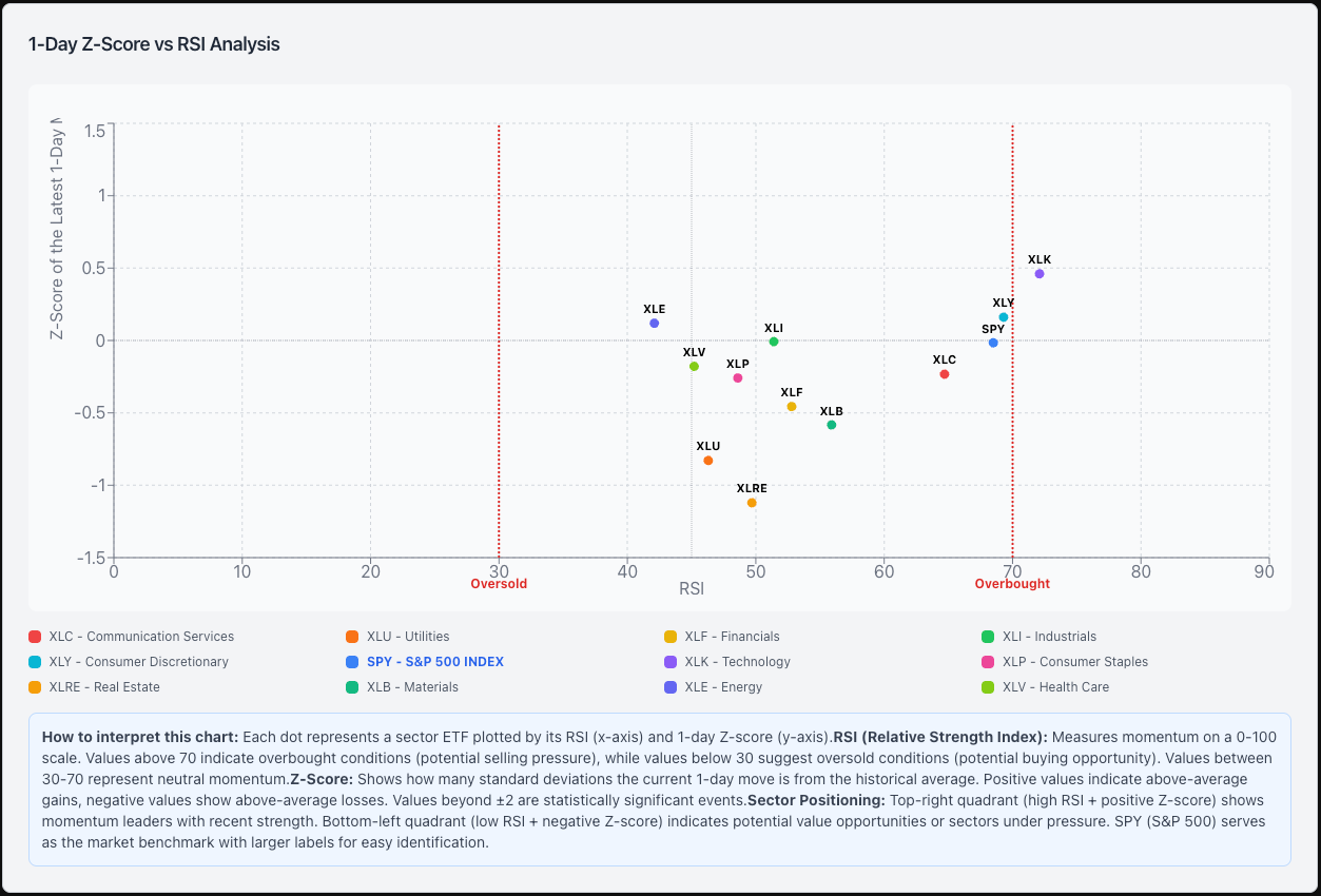
Index (S&P 500) and Sector Tracking: This chart tracks the price performance for the S&P 500 and all sectors (11 total) and translates this data into trading insights. It shows which market sectors are gaining momentum 📈 (z-scores on the y-axis), which ones might be overbought or oversold 🔄 (measured by RSI on the x-axis). The combination of the two helps you find where potential opportunities or risks might be emerging in the economy (e.g. tech is bullish while real estate is bearish)
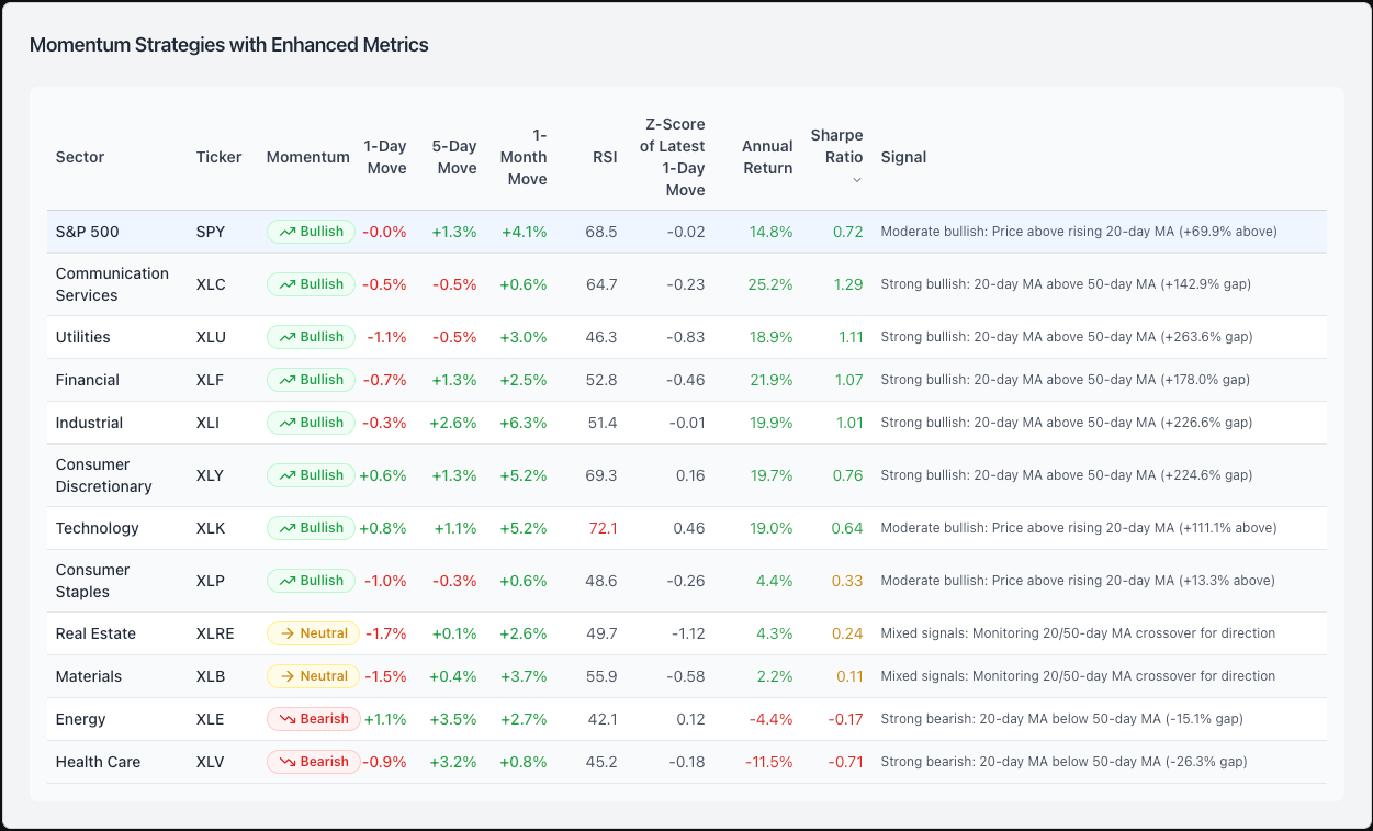
Momentum Analysis: This chart offers a quick bullish, bearish, or neutral signal by sector, helping traders rapidly screen sectors of the economy. This data is useful for (1) showing which sectors have strong bullish 📈 or bearish 📉 momentum and (2) overlaying recent price performance (1, 5, and 30 day) and relative strength readings (RSI) to help determine good entry points. For example, the table shows Communication Services (XLC) with a "Strong Bullish" signal and excellent risk-adjusted performance (Sharpe Ratio: 1.29). However the RSI is 64.7 (near overbought territory at 70) meaning that now might not be the best time to enter the trade. Today’s minor pullback (-0.5%) might give you an opportunity to buy the ETF at a better price.
Feature 2: Economic Analysis
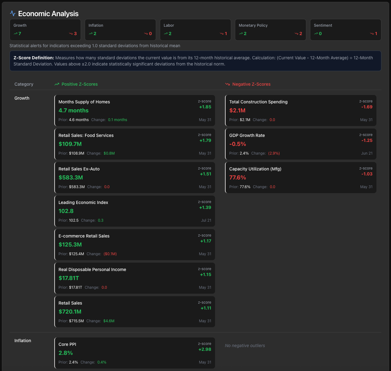
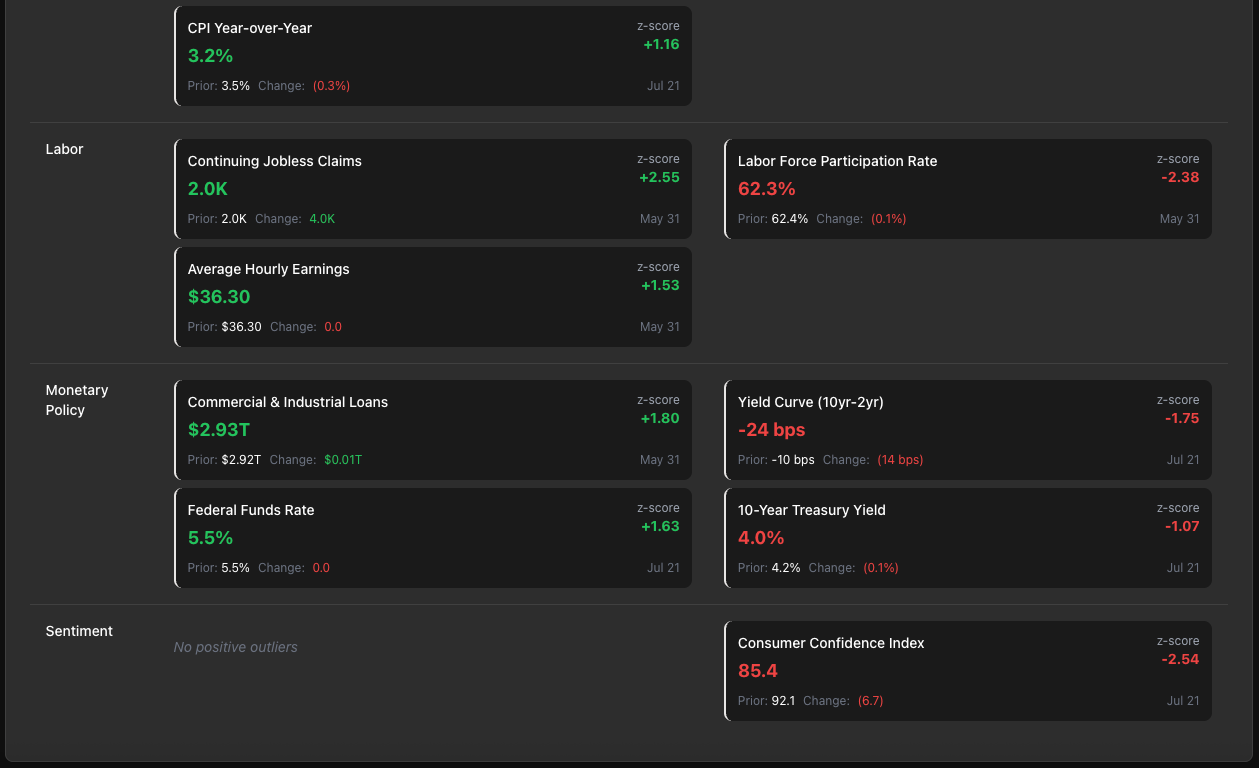
Economic Data Alerts: 📊 This dashboard automatically tracks 40+ key economic indicators (like employment, inflation, and labor data) and calculates how unusual or "normal" each reading is compared to historical patterns using statistical z-scores. This provides a high-level summary of which parts of the economy are strengthening ↗️ or weakening ↘️, and gives a quick overview on the state of the economy. For example, you can see that the labor market is showing some weakness based on Continuing Jobless Claims (Z-score: +2.55 - up is bad in this case) and Labor Force Participation Rate (Z-score: -2.38) which are both flashing signs of deterioration. However, the "Growth" category of indicators shows that consumers are still spending significantly more than the 12-month average (Retail Sales: Z-score: +1.79) and that businesses are investing (Commercial & Industrial Loans: Z-score of +1.80). On balance, the positive signals outweigh the bad so far.
🔗 Live Version: Rishabh's Market Dashboard
🚀 APPENDIX
🏗️ Technical Architecture
Frontend Stack
React 18 with TypeScript
shadcn/ui component library
TanStack Query for data fetching and caching
Tailwind CSS with financial theming
Recharts for scatter plot visualization
Backend Infrastructure
Node.js/Express.js REST API
PostgreSQL with Drizzle ORM
Intelligent Caching (5-minute intervals)
Rate Limiting for API optimization
Data Sources
Twelve Data API: Real-time financial data (SPY, sector ETFs, RSI calculations)
FRED API: Federal Reserve economic indicators
Market Hours Awareness: Optimized refresh during trading hours (9:30 AM - 4:00 PM ET)
Disclaimer: The views and opinions expressed are solely those of the author and do not necessarily reflect those of the author's current employer. This material is for informational purposes only and is not intended to provide legal, tax, financial, or investment advice. Recipients should consult their own advisors before making these types of decisions. The author is not responsible for errors, inaccuracies, or omissions of information; nor for the accuracy or authenticity of the information upon which it relies.


